


Aloft Hotels caters to tech-savvy professional millennials, providing their guests with exactly what they need- fast wifi, sleek design, connection and local knowledge, at a select-service price. However, to keep up with their guests, they were in need of a design refresh.
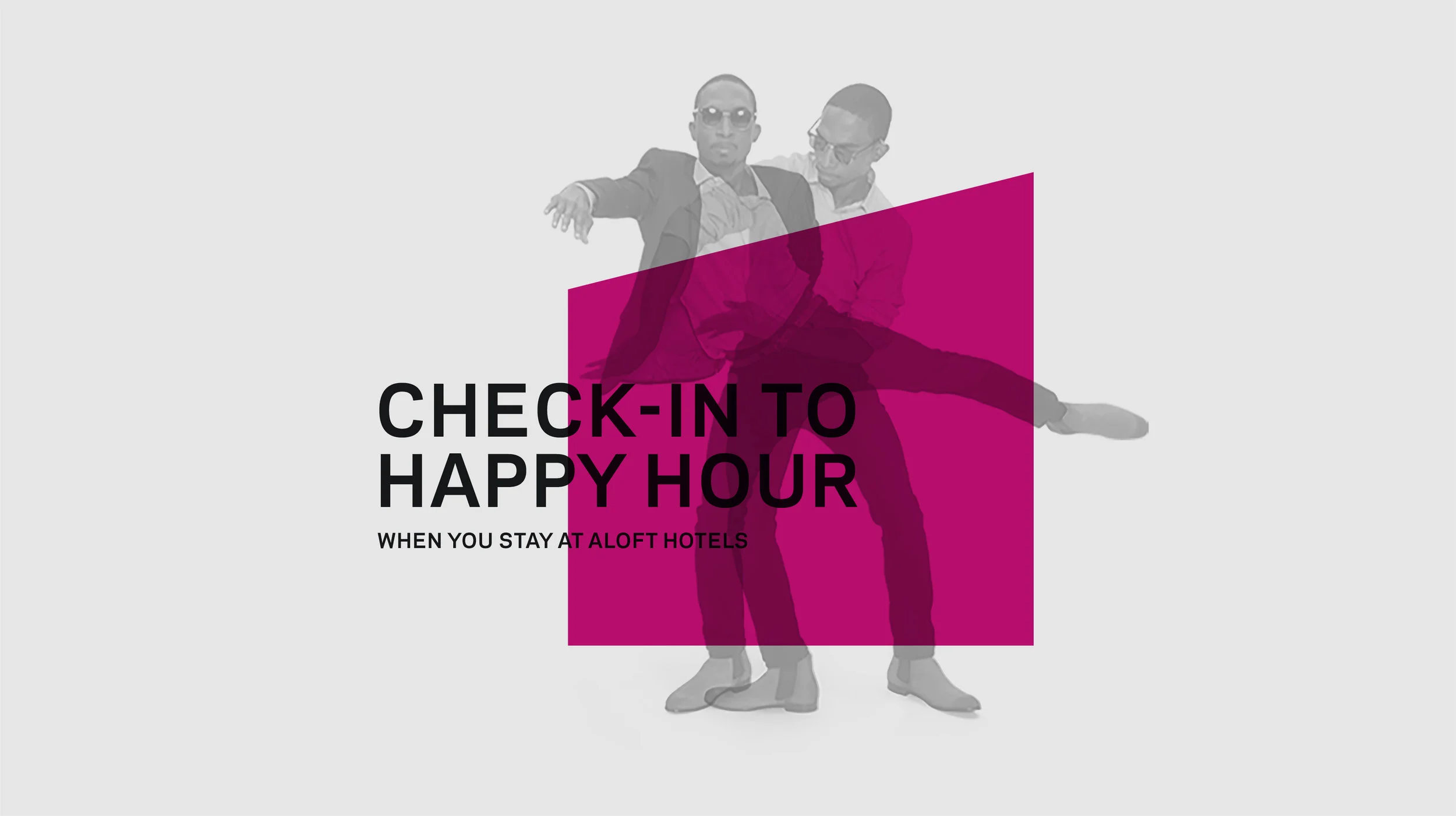
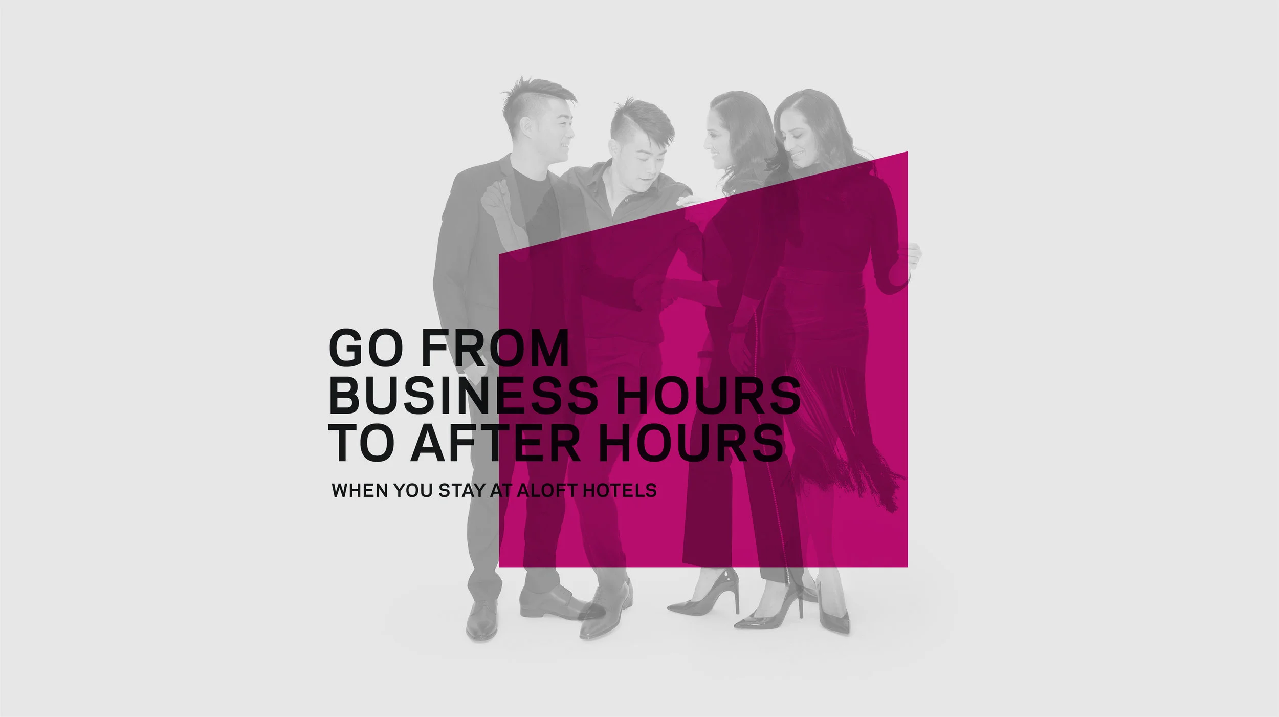
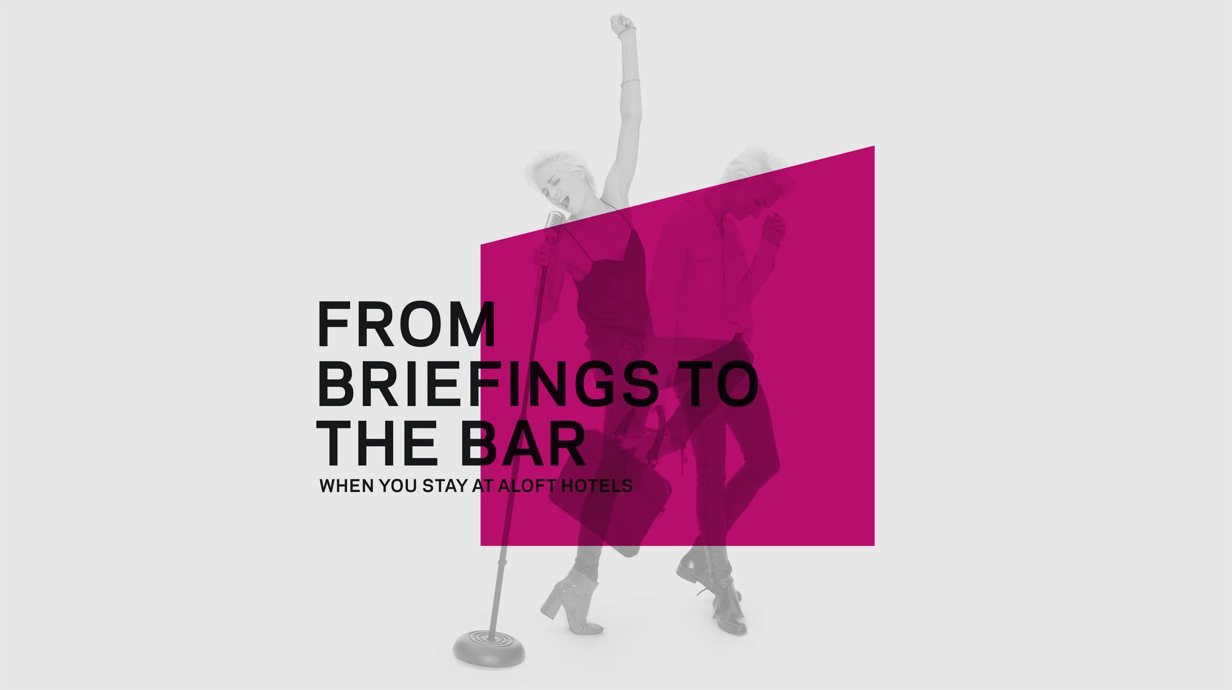
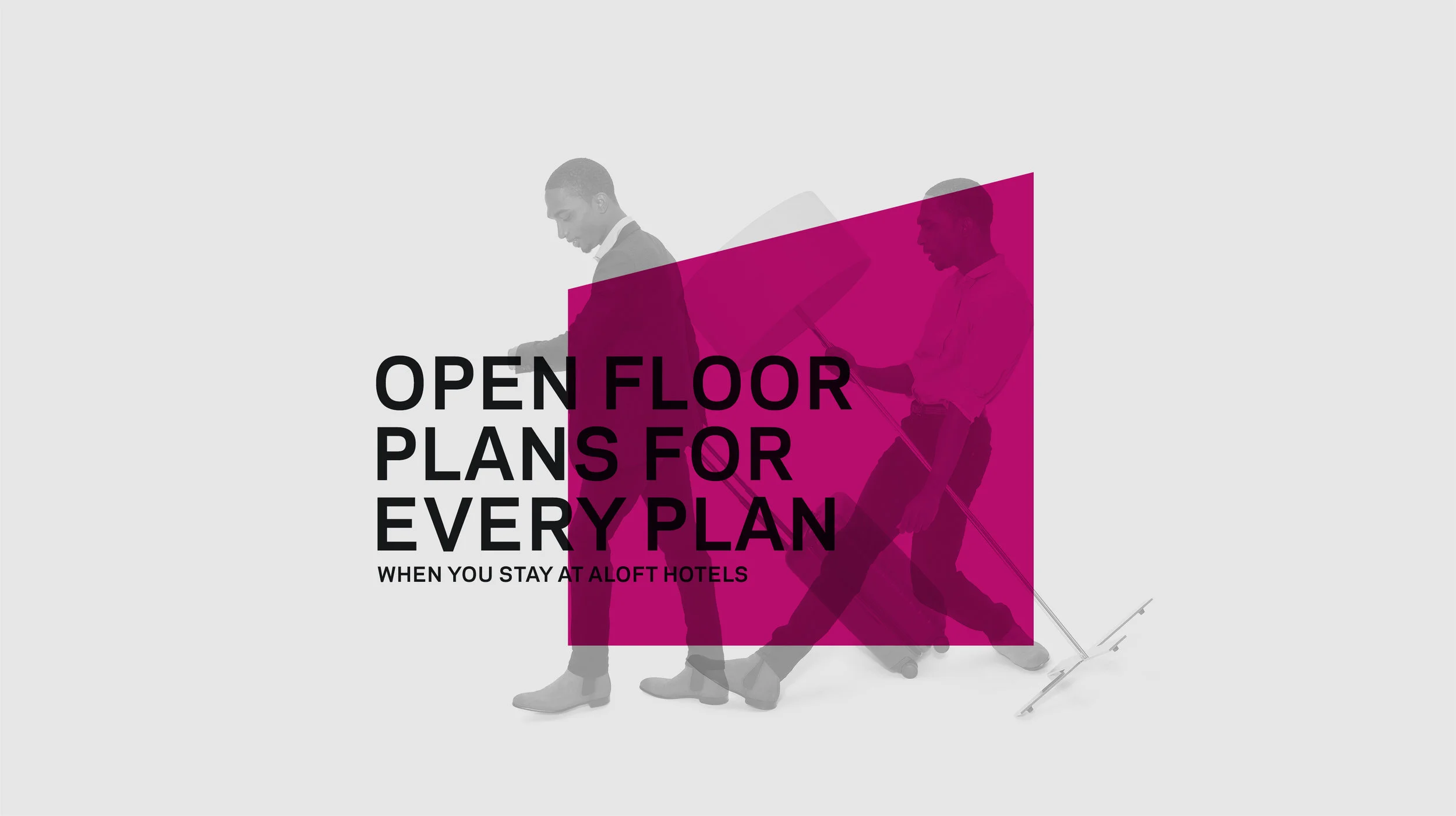
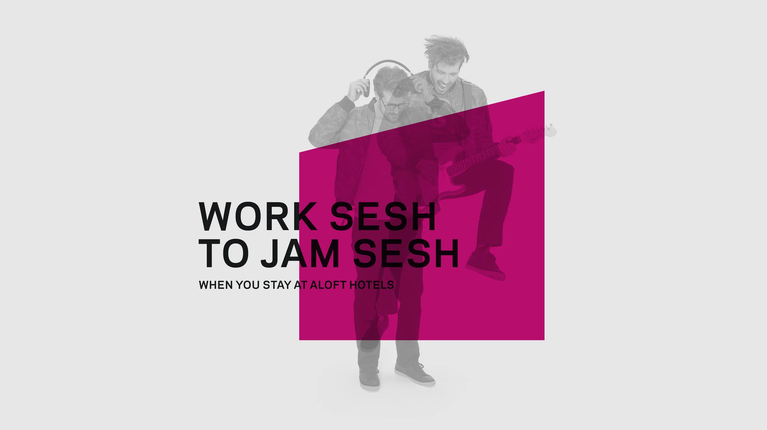
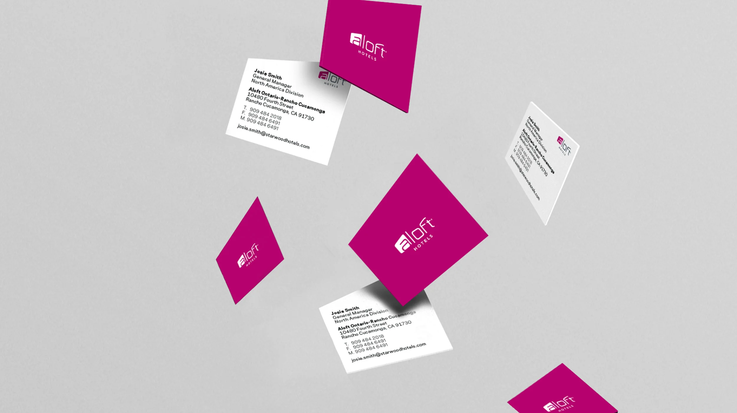
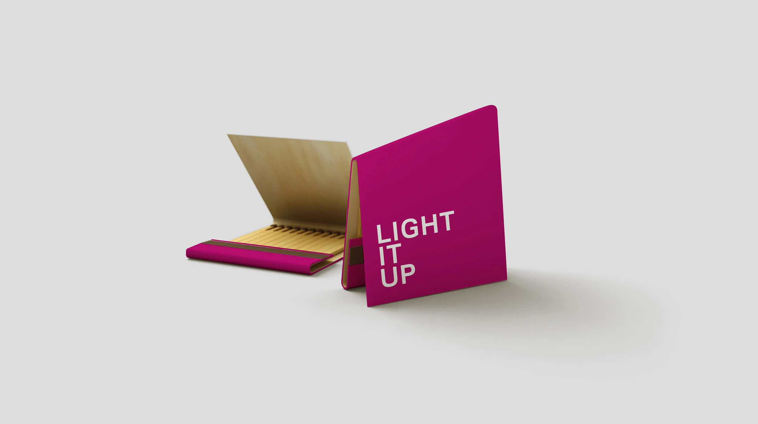
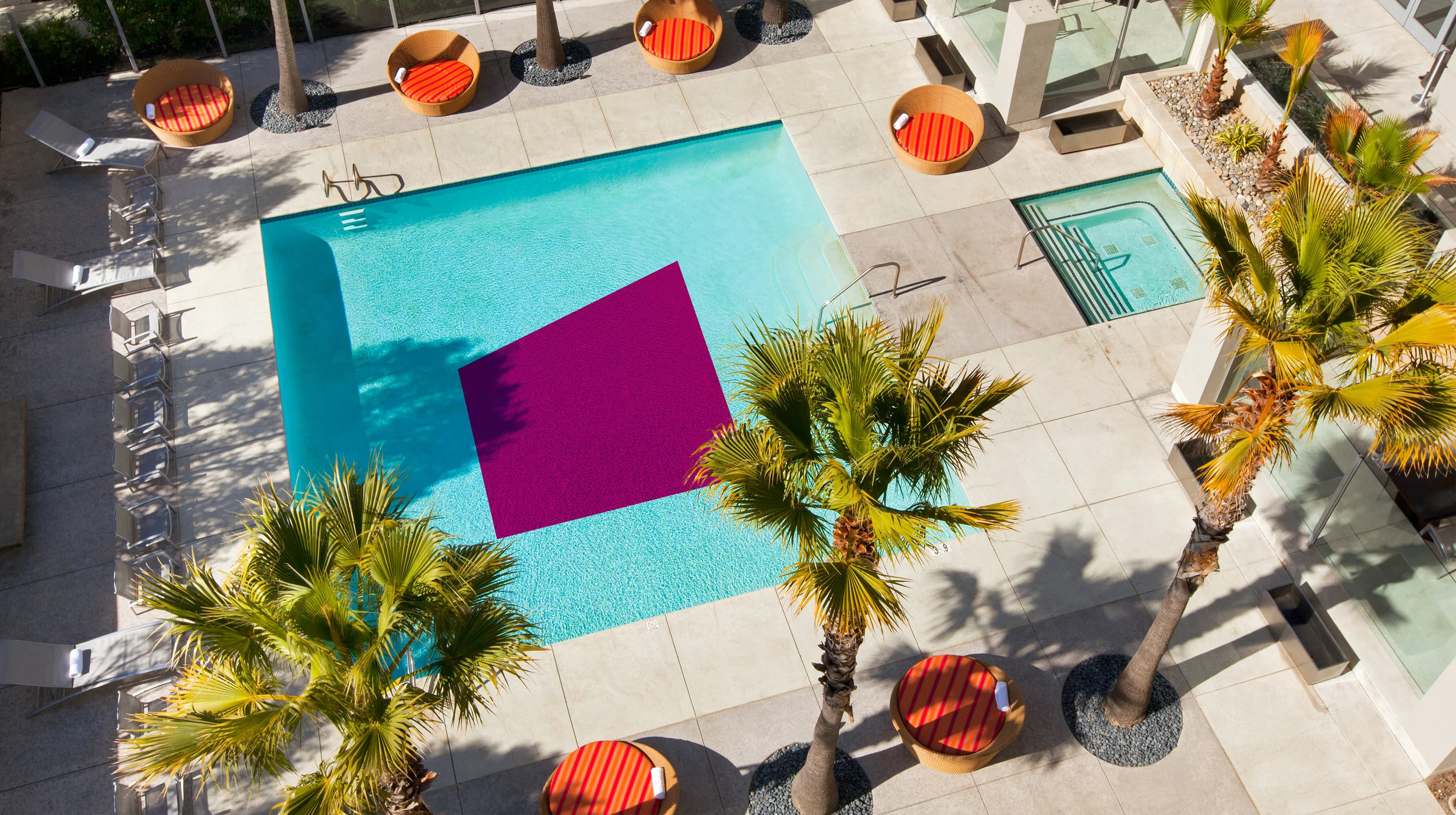
We decided to update the brand’s visual identity by focusing on it’s "not so square" pink icon, using it as a frame to amplify the different elements of personalities of the Aloft guest: work personality versus play personality. This duality is present in every element of the design refresh from print, social videos, to the hotel’s collateral.
Photographer: Ben Rayner